Configurable User Interface Features
This section describes using portals and zones to find and display information. This is the preferred technique used by the base product for query and maintenance dialogue.
Additionally, portals and zones may be configured by your implementation if the base package pages or portals do not satisfy your business needs. Your implementation may opt to do this to provide a more intuitive and business-oriented view of your data. For example, rather than use the base-package's person search and maintenance pages to display and maintain customers, your implementation can configure one or more portals whose zones serve the same purpose.
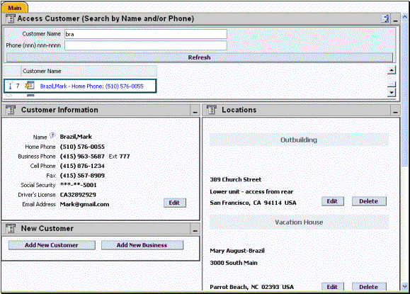
Sample Customer Search Portal and Zones
Contents
Portals and Zones Common to Base Product Pages
The topics in this section describe features and functions common to these configurable zones.
Refer to The Big Picture of Portals and Zones for a description of general portal and zone functionality.
Contents
Common Characteristics of Zones
Info Zones
An "info zone" allows users to see a list of information about an object. For example, your implementation can set up an info zone to display a list of payments made by a customer. The number and type of info zones that appear on your portals differs with every implementation. However, all show a common layout. We'll use the following example of an info zone that's been set up to display an account's bills to describe features shared by all info zones.
Info Zone Common Areas
Everything is configurable. Virtually every aspect of an info zone is controlled by its zone configuration.
The topics in this section describe each area.
Contents
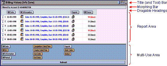
Title Bar
The Title Bar contains the zone's description as well as icons that perform a variety of tasks. Refer to Tools for more information on the special tools icons.
In the corner of the Title Bar, you'll see an indication if the zone is collapsed (i.e., minimized) or expanded. Each time you click the indicator, the zone toggles between being expanded and collapsed. The following is an example of how this zone looks when it's collapsed:
A Collapsed Zone
Recommendation. We recommend that Portal Preferences be set up to collapse zones that aren't needed every time a portal is displayed. Why? Because the system doesn't build collapsed zones when a portal is displayed. Rather, collapsed zones are only built when a user expands them. In other words, indicating a zone is collapsed improves response times.
Morphing Bar
The Morphing Bar appears at the top of the zone. It has three potential states:
· The initial state contains a description of the object whose information appears in the Report Area.
· The second state is a "discard region"; the bar morphs to this state while you drag fields off the Report Area (into the discard region).
· The third state is a Refresh button; this state appears after you have dragged fields on and off the report area (you can click the Refresh button to reload the zone with the new configuration).
Locking the zone. One of the zone's configuration options allows you to define if the Explorer Options Area should be suppressed when the zone is displayed. If you configure a zone like this, the end user cannot add, remove or rearrange columns on the explorer and therefore the Morphing Bar will never morph (it will always contains the description of the time period and filters that were used to build the zone). In addition, the headings will not be dragable.
Hide Description. You can configure the zone to not show the description in the morphing bar. This cases the morphing bar to be hidden when in the initial state described above. Hiding the description does not affect the other states of the morphing bar.
Dragable Headings
The Dragable Headings describe the columns in the Report Area. If the zone hasn't been locked (see prior note), you can drag a heading sideways to reposition it in the Report Area (and therefore change the sort order of the information). You can also drag a heading up to the Morphing Bar to remove it from the Report Area. After moving or removing a heading, you can click the Refresh button to rebuild the Report Area.
Report Area
The Report Area contains rows showing the respective details. For example, if the info zone has been configured to show the various activities that have occurred for an account, a separate row appears for each activity.
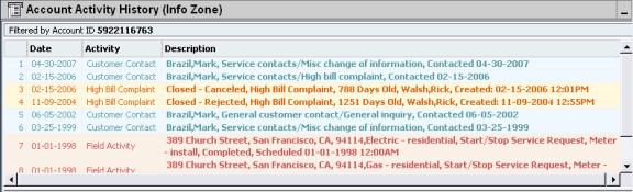
Sample Account Activity Info Zone
Maximum height. The maximum height of the report area is controlled by the zone's configuration. A vertical scroll will appear when more rows exist than fit into the height.
Maximum rows. The maximum number of rows that can appear is controlled by the zone's configuration. Excess rows are truncated before display. Please note, you can configure the zone to download more rows to Excel than appear in the Report Area.
Rearranging columns. The columns that appear by default and their sort order are controlled by the zone's configuration. Columns can be rearranged and additional columns can be dragged into the Report Area if the zone hasn't been "locked". Refer to Morphing Bar and Explorer Options Area for the details. Please note, you can configure the zone to download more columns to Excel than appear in the Report Area.
Control column sorting. You can configure the zone to disable sorting by clicking on column headings. By default column sorting is enabled.
The type and variety of columns that appear in the Report Area is controlled by the zone's configuration. You can even set up an info zone to display information in hierarchical trees. For example, the following info zone has been configured to show an account's service agreements and each service agreement's service points:
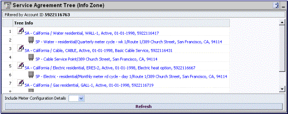
Sample Service Agreement Tree Info Zone
Contents
Broadcasting
The zone might have been configured to "broadcast"
its unique identifier to other zones on the portal. If so, you'll see a broadcast tower icon  on the very first column. If you click the icon, all other zones that
have been configured to rebuild when the respective unique identifier is
broadcast will reload. For example, you
might have configured a zone to display the image of a bill when a bill ID is
broadcast from an info zone.
on the very first column. If you click the icon, all other zones that
have been configured to rebuild when the respective unique identifier is
broadcast will reload. For example, you
might have configured a zone to display the image of a bill when a bill ID is
broadcast from an info zone.
Work Lists
You can configure columns with hyperlinks to be work list-able.
This causes the column’s header to expose a special work list  icon.
Clicking the icon results in populating the dashboard Work List Zone with the entire
column. The user may use the Work List
zone to easily process entries one at a time without returning back to the
source query zone. The work list stays
populated until the user indicates they want to overlay the work list by clicking
a different column's icon.
icon.
Clicking the icon results in populating the dashboard Work List Zone with the entire
column. The user may use the Work List
zone to easily process entries one at a time without returning back to the
source query zone. The work list stays
populated until the user indicates they want to overlay the work list by clicking
a different column's icon.
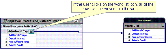
Populating The Work List Zone
When a user clicks on a work list entry in the dashboard, the system will do whatever it would have done if they'd clicked on the hyperlink in the zone. In addition, the system ticks off that they've worked on the entry (this feature is mostly so users know that they've at least looked at something).
Note. The Work List zone is populated only upon user request.
Tools
The Title bar contains icons that perform a variety of tasks. The topics in this section describe the elements of this tool bar.
 Explorer
Zone Menu
Explorer
Zone Menu
Click the explorer zone menu icon to list available tools. The following sections describe each tool.
Contents
Click the reset icon to refresh the zone using its default values.
Click the export to Excel icon to download the zone's data to Excel. This button is hidden if the zone has been configured to not download rows to Excel.
The default setting in Internet Explorer causes Excel to open in the same browser window as your SPL BI session. If you'd prefer to open Excel in a separate window, follow the instruction that applies to your operating system:
· Windows 98. Click on My Computer. Go to View on the top menu bar and then go to Options. Now go to the File Types tab. Among the file types listed, find Microsoft Excel Worksheet and double-click it. A window will open displaying options. Unclick the option Browse in same window. Excel files will now open in a separate window.
· Windows NT, 2000. Click on My Computer. Go to Tools on the top menu bar and click on Folder Options then click on the File Types tab. Among the file types listed, find Microsoft Excel Worksheet and double-click it. A window will open displaying options. Unclick the option Browse in same window. Excel files will now open in a separate window.
· Windows XP. Click on My Computer. Go to Tools on the top menu bar and click on Folder Options then click on the File Types tab. Among the file types listed, find Microsoft Excel Worksheet and click the Advanced button. A window will open displaying options. Unclick the option Browse in same window for the Open action. Excel files will now open in a separate window.
Click the print icon to print the zone.
Click the zone helpicon to show the Help Text Area in the Multi-Use Area. This button only appears if the zone has help text and the Multi-Use Area does not currently contain help text. If you push the help icon again, the multi-use area will be suppressed.
Note. A zone's help text is defined on the zone's configuration.
Click the debug icon to open a pop-up window containing the "raw" data retrieved from the server.
Debug mode only. This icon only appears when the system operates in Debug mode.
Click the Show SQL icon to open a pop-up window containing the SQL statement(s) that the system uses to retrieve the zone's data. Note, this pop-up only contains information if you've turned on the Global debug checkbox in the upper corner of the browser (and make sure to refresh the zone after turning on this checkbox).
Debug mode only. This icon only appears when the system operates in Debug mode.
 Wrench (Open Zone)
Click the wrench icon to transfer to the zone's zone maintenance page. On this page, you can change the parameters that control the zone's behavior.
Debug mode only. This icon only appears when the system operates in Debug mode.
 Show Filters
Click the show filters icon to show the Filter Area in the Multi-Use Area. This button only appears if the zone has been configured to have filters.
When the filters appear in the multi-use area, a "red x" is superimposed on top of the filters icon. If you push the icon again, the multi-use area will be suppressed.
 Show
Explorer Options
Show
Explorer Options
Click the show explorer options icon to show the Explorer Options Area in the Multi-Use Area. This button only appears if the zone has been configured to allow columns to be dragged and dropped into the Report Area.
When the explorer options are shown in the multi-use area, a "red x" is superimposed on top of the show explorer options icon. If you push the icon again, the multi-use area will be suppressed.
Multi-Use Area
The multi-use area is located beneath the Report Area. This area has multiple uses (hence its name!). Clicking the various "show" and "close" buttons described above causes this area's content to change to match the desired usage. The topics in this section describe this area's possible content.
Contents
Initially Suppressed
When a portal page is initially displayed, zones can be configured to suppress their multi-use area. You must click one of the "show" buttons described above to display one of the following areas.
Help Text Area
Expose the Help Text Area (by clicking Show Zone Help) to view help text describing the zone. The following is an example of how the Help Text Area looks:
Help Text Area
As you see in the above example, the help text can be formatted (this is done using HTML in the zone's help text). Refer to Defining Zones for more information about formatting help text.
Filter Area
Click Show Filters to expose the Filter Area. You can use this area to filter the information that appears in the zone by different values. For example, the following shows how a filter area looks for a zone that's been configured to allow users to define the Start Bill Date on an info zone that shows an account's bills
Sample Filter Area
You should click the Refresh button to rebuild the Report Area using the specified filters.
Explorer Options Area
Expose the Explorer Options Area (by clicking Show Explorer Options). This area contains a list of the columns that can appear in the Report Area. The following is an example of how the Explorer Options Area looks:
Sample Explorer Options Area
Columns with a tan background already appear in the Report Area; other columns do not. You can drag a column to the Report Area and then click Refresh to rebuild the zone.
Query Zones
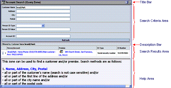
A query zone allows users to find objects matching a given search criteria. For example, your implementation can set up a query zone to find a payment using any number of criteria. The number and type of query zones that appear on your portals differs with every implementation. However, all share a common layout. We'll use the following sample query zone that's been set up to find accounts to describe features shared by all query zones.
Query Zone Common Areas
Everything is configurable. Virtually every aspect of a query zone is controlled by its zone configuration.
The topics in this section describe features unique to query zones (refer to Info Zones for a description of those features shared by both info and query zones).
Contents
Search Criteria
The Search Criteria Area contains the criteria used to find objects. Your implementation team controls the number and type of filters that appear in this area.
When you enter a filter value and click the Refresh button, the system looks for objects that match your search criteria. The results are shown in the Search Results Area.
Press Enter. Rather than clicking the Refresh button, you can press Enter to trigger the search.
Description Bar
The Description Bar describes the search criteria that were used to build the Search Results Area.
Search Results Area
The Search Results Area contains a row for every object that matches the search criteria defined in the Filter Area. The columns that appear can differ depending on the search criteria. For example, if you search for a customer by their driver's license number, the columns may look different than when you search by customer name.
No Drag and Drop. Please note that the columns that appear in the search results cannot be changed using drag and drop.
Multi-Query Zones
This type of zone combines individual Query Zones into a single query zone. A Query Option dropdown, built from the zone descriptions of the individual Query Zones, allows you to select the desired query to execute. Selecting a specific Query Zone display the filters of that query in the filter area. At this point the zone simply executes the selected Query Zone, as if it was executed on a standalone zone. By default, the first query zone option is selected.
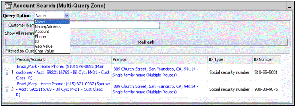
Multi-Query Zone
Map Zones
A map zone displays information related to one or more objects. For example, rather than using the object-maintenance pages to view information about a person and its accounts, your implementation could set up a map zone to display person and account information in a single map zone. Doing this allows your users to see a more intuitive and concise view of the system's objects.
Because the information displayed in a map zone is configured using HTML, virtually any format supported by HTML is possible. The following is an example of a sophisticated map zones that displays a bill using HTML that represents a "near bill image":
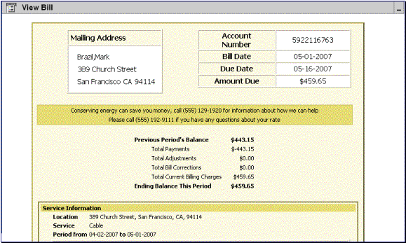
Sample Map Zone
A tool tip can be used to display additional help information to the user. This applies to section elements as well as individual elements on a map. Refer to the tips context sensitive zone associated with the UI Map page for more information on how to enable and provide map help.
Note. You can customize the help icon or disable map help using the Custom Look and Feel feature configuration.
Common Characteristics of Zones
The following topics describe common characteristics of all zone types supported by the base package.
Contents
Zone Visibility
A zone may be configured to dynamically be visible or completely hidden depending on the information being displayed. When hidden not event the header is displayed. Refer to the common Zone Visibility Service Script parameter for further details.
Control Zone Headers
A zone may reference a UI Map to define and control its header. This feature provides the means to achieve a uniform look and feel for the application as well as add functionality to the zone header beyond being just a title bar to open and close the zone. Refer to UI Map and to its context sensitive tips zone for more information on Fragment UI Maps and how they are used to construct zone headers.
The following sections describe common standards followed by the product for base query and maintenance dialogue.
Contents
Separate Query and Maintenance Portals
Zones Common to Maintenance Portals
All-In-One Portal
The all-in-one portal is used for low volume objects, where a small number of records are expected. For example, many control tables use this style of portal. In this portal, rather than separate query and maintenance portals, a single portal allows a user to find a record and maintain the record. A zone listing all existing records is displayed when first entering the portal. A user can perform actions on existing records or add new records from there. More details about the list zone are provided below.
Refer to Zones Common to Maintenance Portals for information about zones commonly found on maintenance portals.
List Zone
This info zone appears when first entering the portal and displays a row for each record. The following functions are commonly available in a list zone:
· An Add link appears in the zone's title bar is used to launch the maintenance BPA script to add a new record.
· A broadcast icon is included in each row. Clicking this icon opens other zones that contain more information about the adjacent record.
· An Edit icon may be included in each row. Clicking this icon launches the maintenance BPA script to modify the adjacent record.
· A Duplicate icon may be included in each row allowing the user to duplicate the adjacent record without having to first display the record.
· A Delete icon may be included in each row allowing the user to delete the adjacent record without having to first display the record.
· If the record has a simple BO lifecycle of Active and Inactive, the list zone may include a button to Activate or Deactivate the adjacent record.
Separate Query and Maintenance Portals
For high volume objects where more sophisticated search criteria is needed to find a particular record, separate portals are provided to search for the record and to maintain it.
The query portal contains a zone to search of the object that you wish to maintain. Additional information about the query portal's search zone is provided below. Clicking an appropriate record in the search results navigates to the object's stand-alone maintenance portal.
Refer to Zones Common to Maintenance Portals for information about zones commonly found on maintenance portals.
Query Portal Search Zone
The query portal contains one zone used to search for the object. The zone may be a standard query zone or may be a multi-query zone providing one or more ways to search for your record.
Once the search results are displayed, click on the hypertext for the desired record's information string to navigate to the stand-alone maintenance portal.
An Add link appears in the zone's title bar is used to launch the maintenance BPA script to add a new record.
Zones Common to Maintenance Portals
The following zones are common to portals used to maintain a record. This includes all-in-one portals (once a record has been broadcast from the list zone) and stand-alone maintenance portals.
Note that additional zones may exist for specific all-in-one portals or stand-alone maintenance portals based on the particular functionality. Refer to the documentation for each portal to understand the specific zones that are provided.
Contents
Actions Zone
Portals used for maintenance may include an Actions zone that includes buttons for performing actions on the record in question.
The zone is a map zone and a service script determines the buttons that appear in the map.
· The actions zone may be configured as an explicit map zone where the buttons are standard for all objects displayed in the zone.
· For more complex objects, the actions zone may be configured as a derived map zone where options on the business object for the related entity are invoked to determine the buttons to display. This allows display of special action buttons for an object. Some examples are discussed below.
The following are some of the action buttons that may be visible:
· Standard maintenance buttons of Edit and Delete.
· A Duplicate button may be provided to allow duplication of the displayed record.
· If the object has lifecycle and the current state has valid next states, buttons to transition to each appropriate next state may be displayed.
· Any special buttons that may be unique for the record being displayed. For example, if there are any stand-alone BPA scripts that may be executed for the displayed record, an action button to launch the BPA may be included.
Object Display Zone
This is a zone that displays the object being maintained. This is typically a derivable map zone where the UI map to use may be defined on the record's business object. If no map is provided on the business object, the zone uses standard html rendering based on the BO schema.
Navigate to the separate search portal. For stand-alone maintenance portals, the object display zone includes a hyperlink to Go to Search allowing a user to navigate to the associated search portal.
Log Zone
If the maintenance object for the record includes a status, it typically has a log that records important events in its lifecycle. This log is shown in an info zone on the portal.
A link appears in the zone's title bar to allow the user to add a new manual log entry.